In this article, We are going to learn unique use case of responsive layout and we are going to learn a responsive technique to handle it. Let’s get started –
Use Case
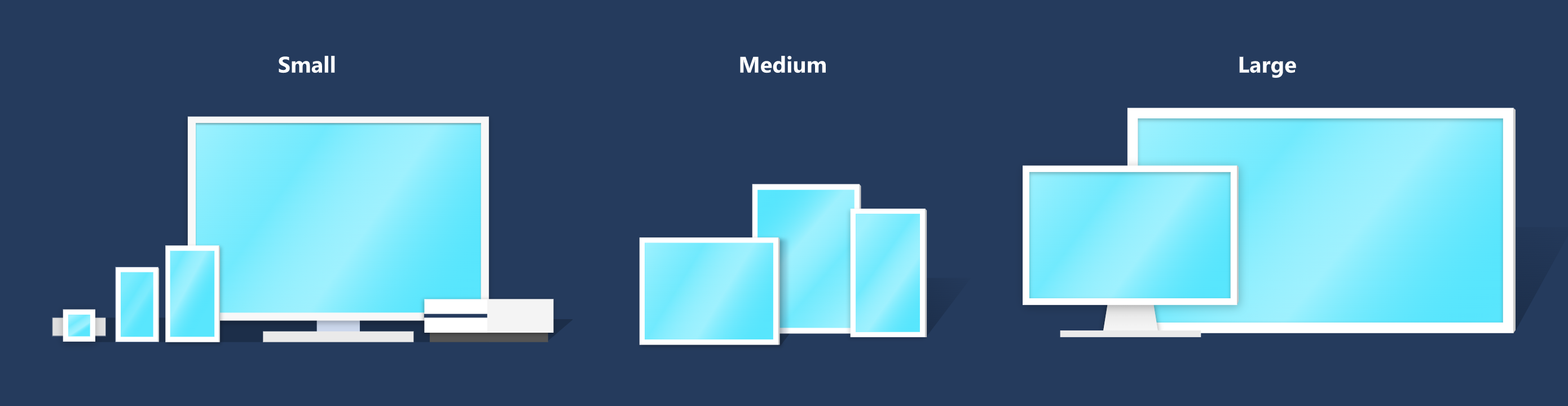
In one of my real time project, I got this responsive requirement where we have to provide responsive support for large screen sizes and everything should look like same as it looks in 1280 x 1024:
Resolution is indicated by how many pixels a monitor displays, and it will be one of the following:
- 1280 x 1024 Super-eXtended Graphics Array (SXGA)
- 1366 x 768 High Definition (HD)
- 1600 x 900 High Definition Plus (HD+)
- 1920 x 1080 Full High Definition (FHD)
- 1920 x 1200 Wide Ultra Extended Graphics Array (WUXGA)
- 2560 x 1440 Quad High Definition (QHD)
- 3440 x 1440 Wide Quad High Definition (WQHD)
- 3840 x 2160 4K or Ultra High Definition (UHD)
Solution Responsive Approach
Let’s quickly recap about both the em and rem
Within CSS, em and remem and rempx, scale better. Consequently, they are more suited for responsive design.
Length values
Length values are CSS data types assigned to CSS properties, such as weight, height, margin, padding, and font-size. Length values are either absolute or relative.
Absolute length values are fixed units, such as px. They are not relative or dependent on anything.
Relative length values, however, are not fixed. They are relative to something else, like the browser’s default font size or the font size of other elements. Examples of relative units include em, remvh.
What are em and rem and why use them?
em is a CSS unit relative to the font size of the parent element, while rem is a CSS unit relative to the font size of an html element. Both of these are scalable units, meaning they give us the ability to scale elements up and down, relative to a set value. This adds more flexibility to our designs and makes our sites more responsive.
A key reason to use scalable units like em and rem is accessibility. Accessibility enables all users, particularly those with disabilities, to successfully interact with a website. Using fixed units like px to set the values of elements, fonts, and space sizes does not give us this accessibility because fixed units do not scale.
By using scalable units like em and rem
Explained em vs. rem
em and rem
Most notably, em and rempx.
As mentioned before, em values are relative to the font-size of the nearest parent element, while rem values are relative to the root font-size, or the font-sizehtml element. And when the root font-sizerem values are relative to the browser’s default font-size16px.
This means that when the root font-size is 16px, a value of 1rem would be 16px * 1 = 16px. And a value of 10rem would be 16px * 10 = 160px.
From the above, we can see that rem values are simple and predictable, and, as a result, we can control how elements scale across the entire page easily from a single source. You can see this demonstrated below:
Solution code sample
/* Root font-size on the document level */
html {
  font-size: 20px; // Here is the secret to this approach (Just change it to font-size: 1.25vw and see the real magic :)
}

@media (max-width: 900px) { // To handle for tablet
  html { font-size: 16px; }
}

@media (max-width: 400px) { // To handle for mobile
  html { font-size: 12px; }
}

/* Type will scale with document */
h1 {
  font-size: 2.6rem;
}

h2 {
  font-size: 1.6rem;
}

h3 {
  font-size: 1.1rem;
}
Why 1.25vw ?
This is because initial requirement and design were provided in 1280px and here is how you can calculate it (16/1280)*100 = 1.25vw
Conclusion
In this article, we learned about em and rem, two similar, scalable, and relative CSS units. However, the key difference between them lies in how browsers compute their pixel values.
While both these units provide the needed flexibility for a responsive design, rem is favoured for its simplicity, consistency, and predictability. And although em can be tricky to use, if you like to scale your page on a modular level, it can be the right choice.
And at the end, we see the real magic when we replace our html tag’s font-size to 1.25vw it started working as per out initial requirement and it looks same on all big screens as similar to 1280 x 1024 resolution.
Demo Link: Click Here to check Code Pen example.
Thanks for reading 🙂